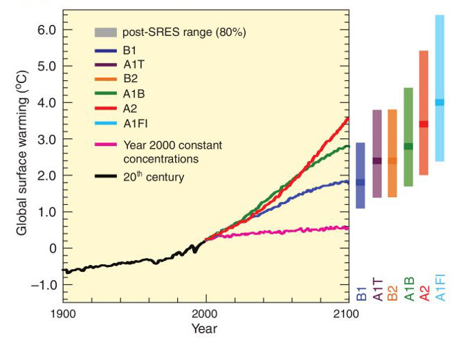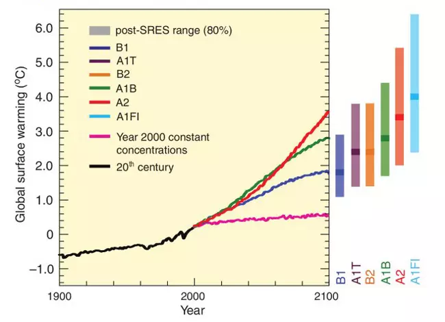
View Original Image at Full SizeFigure 6. Solid lines are global averages of surface warming for scenarios shown as continuations of the 20th-century simulations. The pink line is not a scenario, but is for simulations where GHG concentrations are held constant at year 2000 values. The bars at the right of the figure indicate the best estimate (solid line within each bar) and the likely range assessed for the six SRES marker scenarios at 2090-2099. All temperatures are relative to the period 1980-1999. (Source: IPCC)
Originally uploaded in CAMEL.
Image 62149 is a 493 by 682 pixel WebP
Uploaded:
Aug5 15
Last Modified: 2015-08-05 13:28:27
Permanent URL: https://serc.carleton.edu/download/images/62149/figure_6.webp
The file is referred to in 1 page
- Climate Change
https://camelclimatechange.org/camel/climate_change.html
Provenance
Ginny Brown, National Council for Science and the Environment
ReuseThis item is offered under a Creative Commons Attribution-NonCommercial-ShareAlike license
http://creativecommons.org/licenses/by-nc-sa/3.0/ You may reuse this item for non-commercial purposes as long as you provide attribution and offer any derivative works under a similar license.